Personalized Hearing
Calibrating audio settings of Here One wireless earbuds for individual hearing needs
Research
iterative design
mobile
A quick summary
One of the projects I worked on at Doppler Labs was testing and designing a hearing calibration feature for the Here One wireless earbuds and companion app. I considered usability, functional benefit, and the emotional experience of people with diverse hearing needs.
Business Context
Pivoting to new target markets: hearing health
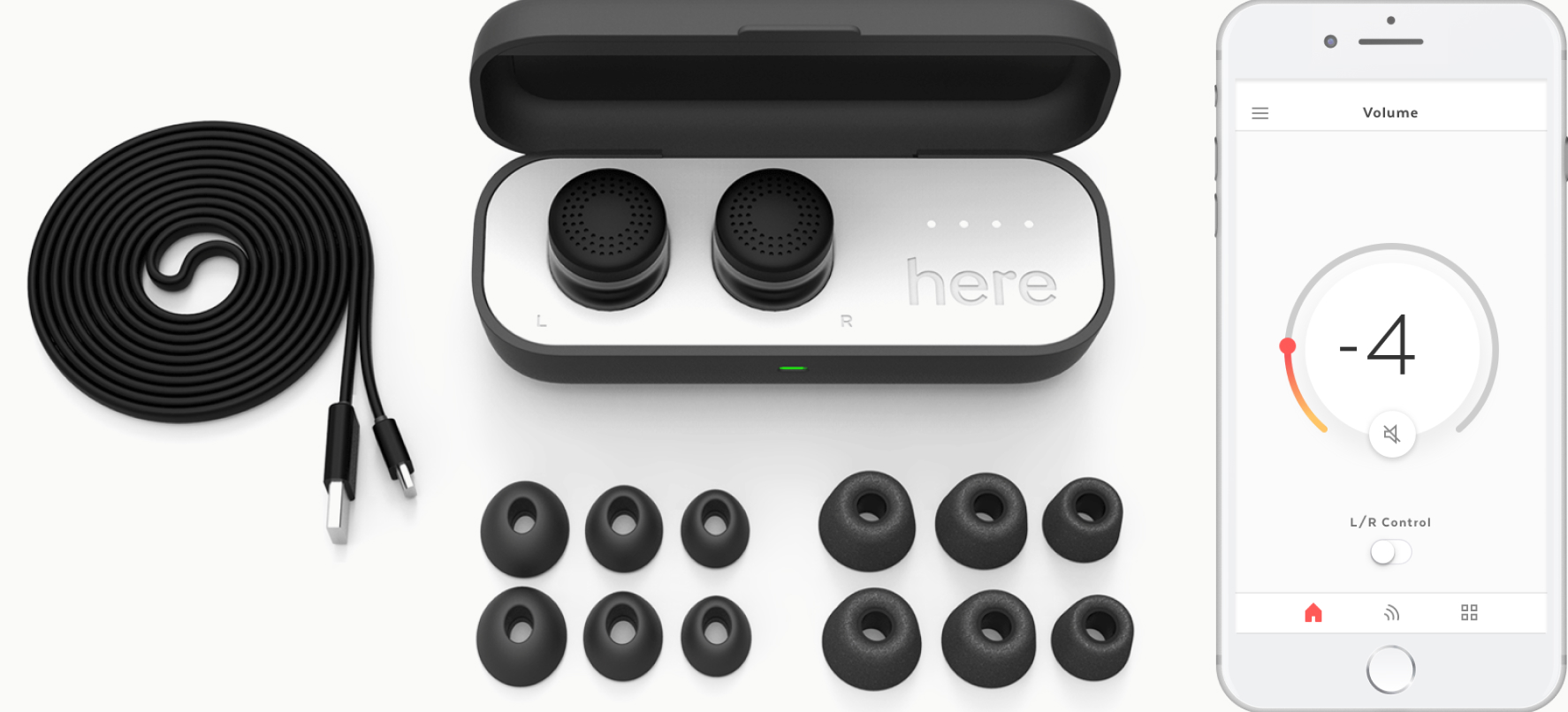
My first job was at Doppler Labs, a startup focusing on hearing and in-ear computing. Doppler Labs is best known for launching Here One, selective sound controlling earbuds.
Here One's tech was originally marketed to audiophiles and urbanites. Who doesn’t want to amp reverb at a live concert, or tune out the rumble of the NYC subway? When we launched our wireless earbuds on Kickstarter, we saw that our product had massive potential to change the lives of people with hearing loss, tinnitus, misophonia, auditory processing disorder, and hyperacusis. We started to invest in hearing health initiatives to support these communities.
HUMAN PROBLEM
Is the new hearing calibration feature helpful? Relevant?
We quickly prototyped our first hearing health feature. Similar to calibrating headphones for music, this new feature the calibrated Here One to real world sounds around you.
However, we were still learning a lot about people with hearing loss and hearing sensitivities, and how to improve their lives. We were also curious how relevant hearing calibration felt to all Here One users, including users that did not self-identify with these communities.
TLDR; we wanted to test and improve the new hearing calibration experience before release.
solution
Improved iOS app design for product release
I conducted mixed methods research to help identify and address pain points and opportunities before feature release.
I then re-designed the calibration experience. The updated companion app design and firmware changes supported an easier and more meaningful hearing calibration experience for users. We also saw increased feature engagement after users completed onboarding.
My role + team
  • Led usability testing to final design for launch
  • Close collaboration with a product manager and support from a senior designer
  • Startup environment
TIMELINE + Constraints
  • 3 months

  • Multiple audiences
  • Hardware limitations
  • Parallel app look and feel workstream
SKILLS
  • Mixed-methods research
  • Research synthesis
  • Design requirements
  • Companion app design
About Here One
What if you could control your hearing?
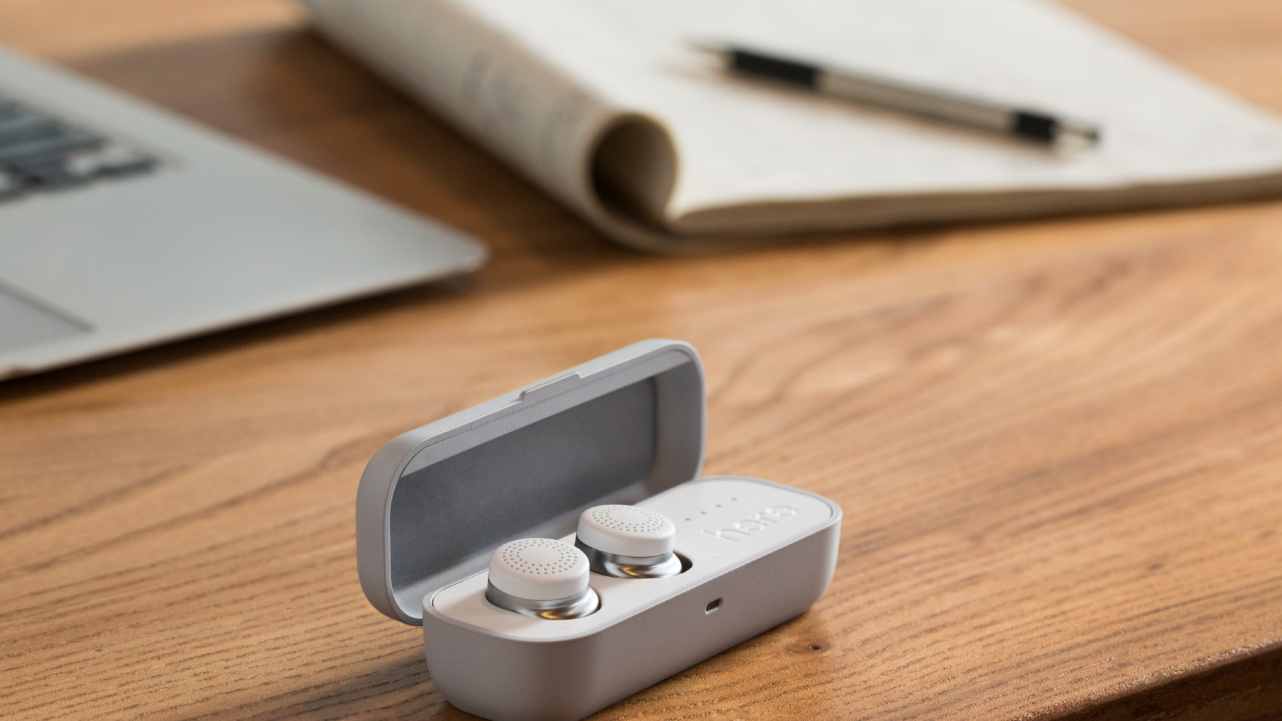
That was the idea behind Here One, wireless ear buds that allow you to adjust your hearing in real time using the Here One app.
Real world volume control
Use active noise cancellation to apply a “volume knob” to the world.
Equalizer
Adjust specific frequencies of what you hear.
Filters
Selectively enhance or dampen sounds in specific envionments like restaurants, airplanes, or concerts.
New initiatives for hearing health
After realizing that our technology had massive potential to change the lives of hard of hearing and sensitive hearing communities, Doppler Labs created dedicated product initiatives to support these communities, including: speech directionality, L/R hearing and personalized profiles.
Battling stigma and binary constructs
Doppler Labs was conscious of the social stigma attached to hearing loss and other conditions. While our journey in de-stigmatizing hearing loss expands well beyond this case study, and it’s worth noting that our approach was to dissolve binary constructs and stigma around hearing.
The situation
Spearheading research and design of our first hearing health feature
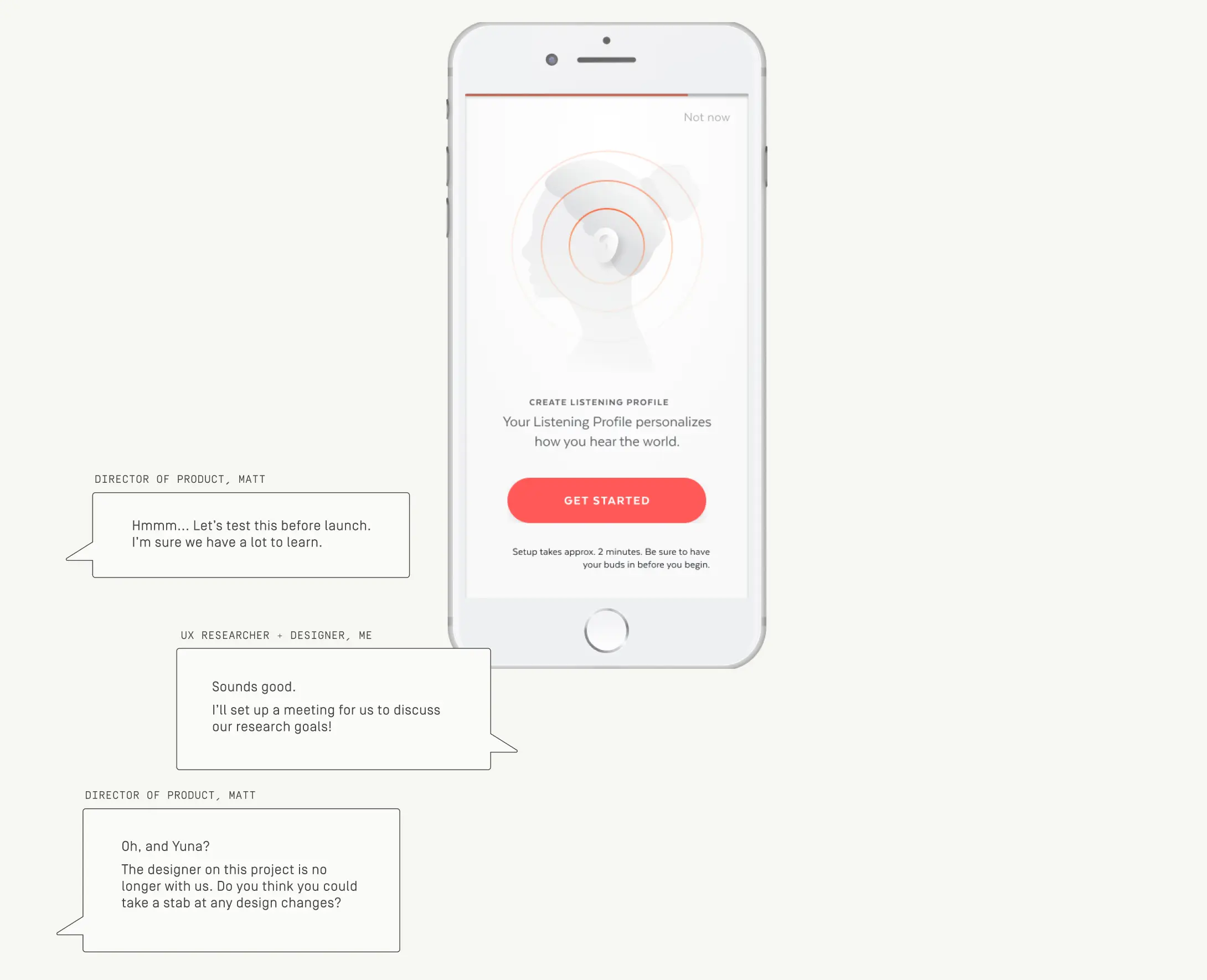
What if people could personalize how they heard real world sounds based on their individual needs and preferences? Our first hearing health initiative was Listening Profile: A hearing calibration feature designed to personalize the sound output of the Here One wireless earbuds to the individual's hearing.
Since there were many uncertainties about the UX and overall value of the feature, the product manager was eager to iteratively test and improve the solution before release. Since I had been regularly communicating with people from the hard of hearing and hearing sensitive communities, I was trusted not only to conduct research but takeover the design.
PREvious design
Listening Profile
A series of tones are played to calibrate the sound output of each frequency range to a user’s individual hearing needs and preferences.
Calibration is part of the general onboarding process and sets a new baseline for additional settings that can be applied in the app.
Process
From evaluative research to design
The initial design of the Listening Profile calibration process was designed by another designer on the team (who left the company shortly after). My job was to conduct research and update the interaction flow based on the research I conducted.
Research plan
Evaluating our design: usability, user perception, and long term benefits
Our research goals did not only involve understanding usability and comprehension, but user perception and longer term functional and emotional value. We took to mixed-methods evaluative research to answer our questions.
A. Usability testing
To gather initial reactions and screen-level feedback, I recruited a total of 8 research participants in the area to test the usability and comprehension of our functional prototype in-person.​​​ Testing involved  screens and audio feedback via the Here One ear buds.
B. Beta testing
To address the remaining research questions, participants in the usability study were given functional prototypes to take home. I also recruited 21 additional participants who participated in the study remotely for over 30+ days. There were a total of 27 beta testers.
Semi-structured interviews
I conducted more interviews remotely to follow up with participant experiences.
Research informing design
Screen-level learnings
In the first iteration, the task flow consisted of 5 tones playing intermittently in each ear. The user was asked to adjust the slider to a position in which they were “barely able to hear the tone”. After all 10 tones were completed, the app revealed the user’s ‘Listening Profile’.
I tested the following first iteration and identified opportunities for improvement.
Product-level learnings
The beta program helped me understand the end-to-end experience with hearing calibration, including long term usage and benefits. Some relevant findings included:
  • A 5-band frequency profile risked being too coarse for hearing sensitive users.
  • While the diversity of Listening Profiles among ~40% of beta testers was a testament to the value of personalization, most people had the same Listening Profile, suggesting the baseline should be adjusted.
  • Few users attempted to re-engage with their Listening Profile after setting it up during the onboarding process.
Design objectives
Synthesizing research into next steps
The research learnings above, as well as competitive analysis and alignment with the product team, informed the following design objectives.
01
scan noise levels
Ensure the environment is sufficiently quiet before the user begins the calibration process so they can hear the tones.
02
reduce anxiety of test-taking
Reduce feelings of anxiety and effort required by users by exploring alternative designs and communication: everyone is unique, with different hearing.
03
consider moderate to severe hearing loss
Reduce disappointment among users that are not able to hear the tone at the current maximum volume.
04
make profile more robust
Revisit 5-band frequency profile, which can be hurtful to hearing sensitive users.
05
encourage engagement post-onboarding
Encourage users to engage with the LP feature more post-onboarding.
Exploration example
Rethinking the original slider affordance
How should users indicate the volume level they could first hear each tone? The original design required a lot of concentration from users and disappointed hard of hearing users that were not able to hear tones at any volume.
I explored alternative ways to help users navigate discrete (rather than continuous) volume levels. I also considered how to make volume levels feel more relative, rather than absolute measures of hearing ability.
Solution
Interaction and functionality updates
Based on the design objectives, I referenced existing visual design language to re-design the feature for launch. Note: The look and feel updates were led by another designer.
6 Key changes for launch
04
audio feedback
ORIGINAL
UPDATED
Continuous tone
Tones play continuously, rather than intermittently, reducing the tendency for users to ‘overshoot’ and go backwards.
Louder tones
Louder tones address disappointment from hard of hearing users that did not hear anything in the original design.
Personal growth
Connecting research and design
While I was the sole resarcher at Doppler Labs, the company was small enough that you could wear many hats. For this project I was fortunate enough to be able to apply my research in designing the Here One companion app. Moving through the end-to-end process helped me understand how research and design are informed by one another.
Building trust
"How someone hears” is not something that is observable through sight. Nor is hearing health a topic that people are immediately open to talking about – it's a sensitive topic for most people to discuss with others, let along admit to themselves given the existing stigma. This project honed my interview skills. By the end it felt that I had built meaningful trust with many research participants, some who continued to reach out to me after the project was complete.
Next project
Recess
Building immersive environments to support remote students build classmate relationships
prototyping
3d
school-project